The Primary Navigation Bar: Is It Old School
Mobile Marketing | Graphic & Information Design | Content, Social & Digital Marketing
We've been developing quite a few websites lately and I'm interested in hearing what others think about this long-held model of the Primary Navigation Bar. Developed originally as an area to provide a consistent pathway across a collection of content, the primary navigation bar became a staple feature of website best practices in the late 90s and frankly, not much has changed since.
In today's world where mobile now dominates the digital experience, we're seeing example after example of the disappearance of the primary nav bar in lieu of the stacked horizontal line icon (also called the "nav burger") which has come to represent the Menu of options.
Mobile strips everything to its core components. There's not enough screen room for a big honking primary nav bar and mega menu rollovers on mobile. What's the solution? Eliminate it! Rethink how navigation is done. This led to organizations having a "Full Site" and a "Mobile Site" with the latter being a stripped down version and typically having the starting interface as nothing but the navigation.
The issue with this approach is that you now need 2 sites: full and mobile (or as a lot of consultants would tell you "mobile optimized"). Some organizations did this and others put it on The List. Enter responsive design which allows you to build one site that works on any device and now we're getting somewhere (note: consultants trying to hustle you on new $5k+ mobile optimized website are not fans of what I'm saying here).
The premise holds that if your audience primarily uses mobile to receive and decide whether or not to consume your content, you need everything to be responsive. This includes:
-website
-landing pages
-email preference pages
-blog
-images
-anything else
Now we're back to the design challenge of building a new website that can be consumed on any device. We are going to use our design premise as the user will view our digital presence on mobile first. We better take a mobile first design approach in order to arrive at an optimal design.
Optimal mobile design would necessitate the absence of a primary navigation bar.
I'm on the hunt for more and more examples of this design trend that is eliminating the space taken up by primary nav and going to clean icons that allow the user to obtain the navigation menu as needed.
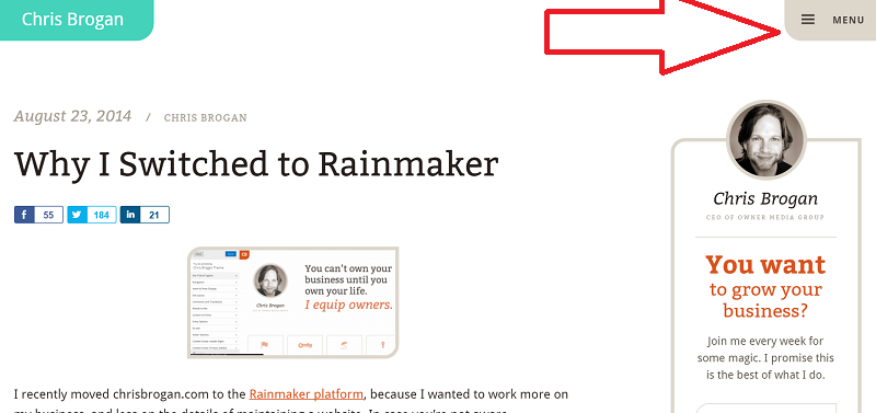
Here's an example:
Notice how Chris Brogan's site has stripped down everything to the barest essentials. It's easy to understand, he doesn't lose the reader because he keeps in the word "Menu" (slicker sites for super savvy audiences would just leave the horizontal lines) and it allows content to rise up to the top giving greater value to the user.
The big question remains as to whether to have a primary nav or nav burger is "who is your target audience" and this can be further broken down into:
1) who's your loyal subscriber audience (members, clients, staff, customers)
2) who do you want to attract to grow (prospective members, clients, employees, customers, donors)
The two might not be the same and if you're like many an association, you want to grow membership in the Millennial generaton, but need to continue to serve your loyal subscriber base typically Boomers.
The new design challenge may very well not be "Full Site" versus "Mobile Optimized", but Loyal Members versus Growth Audience.
The question remains: does keeping your primary nav menu already cast you as being old school and we can move away from it as a standard feature, or is it audience-dependent based on their mobile familiarity?


